😀 Welcome to my Ancillary Tasks page! This page exhibits all of the milestones that I took to produce my Ancillary tasks! This page will be jam-packed with draft work and even more of my terrible drawing skills! I hope you enjoy! 😀
Key:
Blue Text - Planning
Purple Text - Secondary Research
Orange Text - Drafting
Red Text - Problems encountered
Green Text - Problems Overcame
Pink Text - Changes
Turquoise Text - Application
Introduction to Ancillary Tasks:
Welcome to my Ancillary Tasks page! This area of my G324 project will enable me to unleash my creativity and project this into forming an original film poster for my production "The Gatekeepers" as well as constructing a film review for my AS media film "Faulty Perception".
In order to succeed within this section, I will need to utilise my knowledge of the media and technology in order to produce two Ancillary pieces! Both tasks will challenge my: subject knowledge, analytical skills and my drafting work. The progress of my two Ancillary pieces should be presented to you clearly and coherently throughout this page!
Let's jump into this! My first task which accommodates within this section is to construct a film poster. This division of my Ancillary Tasks will be jam-packed with research and draft work. Ultimately, I will form my own film poster for my production "The Gatekeepers" using the software "Photoshop"! - However, when it came to constructing my film poster, I was left with no other choice but to use the software "Pixlr"!
What actually is a film poster?
So, what actually IS a film poster? Well, a film poster is a form of advertisement which is used to quickly grasp the eyes of the consumers/ public! They are usually placed in areas where they would be easily noticed at a glance, for example: a billboard sign, public transport (printed onto the sides of busses/ train platforms), magazines etc. Examples from the real world are depicted below:
There are many elements that must be taken into consideration when constructing a film poster, these include:
- Tagline
- Age certificate
- Positioning
- Alignment
- Text
- Font
- Imagery/ Iconographies
- Colouring
- Distribution Company
- Production Company
- Credits
- Reviews
- Film Rating
- Release Date
- Name of Director/ Cast
I will now begin my research into film posters in order to identify how the list previously mentioned differs throughout different film posters. I will research into both mainstream film posters and independent film posters in order to gain a solid insight into a broad spectrum of how film posters differ between each other.
Research into Mainstream Film Posters:
The four step technique known as "AIDA" is used within a range of advertising companies as a model to refer back to when considering how to attract consumers - this model operates in a criterion based network which assists advertising companies in constructing successful film posters. Each syllable corresponds to a word!
The model is depicted within the image shown to you below:
1) Attention:
A successful film poster must be victorious in gaining attention through utilising a broad spectrum of iconographies which enable the audience to slightly glimpse into the narrative without giving too much of the narrative away! Imagery assists a advertising company in elevating a films status, is it an essential ingredient when constructing a film poster!
For example, Titanic's film poster hints towards the audience that the narrative of this film will be derived around a relationship which is evident through the two characters romantically hugging each other - the imagery of the two characters fades into the sky which could possible be a reference to the afterlife/ death (heaven). However, the boat is positioned in between the two characters which signifies that the ship itself might be responsible for separating the two (acquires a connotation/ deeper meaning - inflicting death.)
 |
| If I gained £1 for the amount of times someone has told me that they have cried whilst watching the ending of this film, I would be a millionaire right now. |
2) Interest:
If a film utilises a brand new (original) concept and cannot be explained through iconographies alone, then the designers will have no other choice but to implement an image which gives the audience a further detail into the story. Each film poster must have it's own style which makes it recognisable and memorable, the poster must be modified tightly to the narrative in order to set it apart from other film posters.
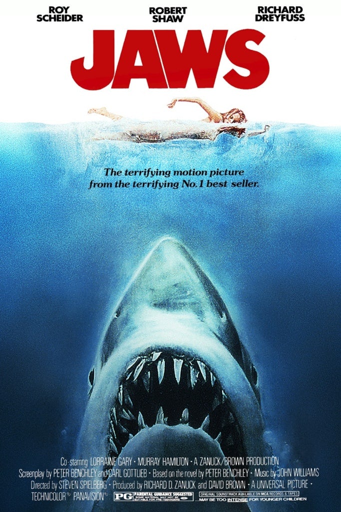
For example, Jaws' film poster is recognisable as the sharks teeth is used as the major focal point. The grotesque teeth instantly gain the interest of people walking past and intrigues them to seek out more about the narrative (sparks interest). This is successful as we typically associate Jaws with it's iconic film poster rather than the narrative itself. This is a clear indication of a successful film poster!
For example, Jaws' film poster is recognisable as the sharks teeth is used as the major focal point. The grotesque teeth instantly gain the interest of people walking past and intrigues them to seek out more about the narrative (sparks interest). This is successful as we typically associate Jaws with it's iconic film poster rather than the narrative itself. This is a clear indication of a successful film poster!
3) Desire:
Every media product has the desire to accumulate fans in order to reinforce their product. The aim of marketing is to form the largest fan-base as possible, this can only be established through a successful film poster which tempts the general public to consume the product. The most successful film posters acquire the purpose of targeting a mass audience as it gains attention from all age groups in comparison to those that plan on targeting a niche audience.
A perfect example here is the conglomerate, Disney. All Disney films manage to accumulate fans globally as they acquire the purpose of targeting a mass audience though their family-friendly/ westernised iconographies used within their film posters. Within the Lion King's film poster, deadly animals such as Lions are presented as "cute" and "fluffy" which juxtaposes the idea that they can mutilate prey in seconds if encountered in the wild (taking a negative iconography and making it positive.)
4) Action:
Finally, action must be taken regarding the 3 previous stages in order to create a successful film poser. However, the advertising company should avoid creating a film poster which is too complex as it leads to a downfall in the future - the same style should be used in follow-up blockbusters in the future - this is called a lasting effect!
For example, the Jurassic Park series is perfect in establishing this as the advertisement company have kept it basic and recognisable to audiences. Therefore, when it is released on DVD/ distribution networks audiences will know exactly what they're looking for which is a strong advantage over other films which take upon a more complex style.
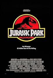 |
| The design here is very basic but can be easily replicated as a result of it's iconic/ recognisable logo. |
Mainstream Film Poster Annotations:
Now that I have done some research into mainstream film posters, I have decided to apply my knowledge to mainstream film posters. I have annotated 4 mainstream/ highly successful film posters, they are depicted to you below:
A correlation that I have noticed within mainstream film posters is that the director/producer is always stated in the context of "From the director/producer of [insert film name]".
This is used as a selling point which attracts consumers and gains attention, this piece of text is always positioned at the top of the page in a different font/ text colour from the rest of the posters font/ text colour so that it is easily noticed. This technique foreshadows the films success, this is evident through the case of Avatar which has the highest gross rate of all time.
For example:
Avatar - "From the Director of Terminator 2 and Titanic" (Both films are highly successful will a large fan base, this will assist Avatar in attracting audiences.)
Star Trek - The writing is very small, so I cannot indicate the cast member credited, this is something I will avoid when constructing my film poster!
The Incredibles - "From the creators of Finding Nemo" (Finding Nemo is a highly successful family-friendly film which
Independent Film Research:
I will now research into independent film posters in order to gain an insight into how "AIDA" is applied to independent film posters and perhaps comment on why independent film posters lack success in comparison to mainstream film posters.
- The BFI (British Film institute) is a British film institute which promotes and preserves film making within the United Kingdom. The BFI utilises Lottery Funds in order to support film production within the UK. It also funds and distributes independent British films (like our film) and aims in expanding audiences through their diverse releases.
- However, some television broadcasters like: BBC films and Film Four also fund independent films. This suggests that though independent films tend to be limited in resources (such as budget), there are many companies which are willing to fund them - as well as the assistance of crowdfunding on the internet which suggests that the increase of technology/ globalisation has benefitted the expansion of independent film making.
Primer:
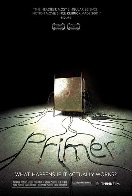
"Primer" (2004) directed by Shane Carruth is an independent thriller film which is based around the concept of a time machine. This is illustrated through the iconography of what appears to be a broken machine depicted in the centre of the poster with a flashing light shining down upon it - this is the focal point of the poster as the attention of the audience is diverted towards the only image on the poster (arises attention to this area).
The concept of a broken machine is reinforced through the font and the alignment of the title which is written in broken/ tangled wires and lies on the floor, facing upwards towards the sight of the audience which suggests that someone has deliberately handled with the machine in order to trap the protagonists within a different time era.
The darkness surrounding the time machine foreshadows that something dark/ deep is lurking within the plot. The vagueness of the poster hints towards the mystery sub-genre which is reinforced through the rhetorical question within the tagline "What happens if it actually works" - foreshadows that the time machine will function and there will be consequences which captivates audiences to consume this film - reinforces curiosity in relation to our film.
Birds of America:
"Birds of America" (2008) directed by Craig Lucas is an independent comedy film. The colouring is fairly the same with virtually all of the content being positioned on the right side of the poster which instantly diverts attention to the right side of the film poster. However, the text is depicted in white and is aligned above the image(s) so it is easily identified by the audience (breaks the repetitive use of baby blue and different shades of orange within the film poster.)
The focal point of this poster are the four birds (image) positioned on the right hand side of the poster. A tie is positioned around the neck of one bird (the father), a plaster is positioned on another bird (the mother), and there are two smaller birds positioned in the background (the children). These birds resemble a family! I can also indicate bird waste depicted on the left side of the poster which utilises the comedy genre within the film poster as it brings some light hearted humour into the equation.
The People Under The Stairs:
"The People Under The Stairs" (1991) directed by Wes Craven is an independent horror film. The first thing that I noticed about this film poster is that there are two focal points: the fading skull bulging above the house, and the house itself. Ironically, both images are positioned in the centre of the poster which emphasises their significance to the plot.
The enlarged skull gains the attention of the audience, which encourages consumers scan their eyes over the poster (Attention in AIDA). The title can be easily indicated as it is aligned in the centre of the poster, present in red.
The colour red acquires many connotations such as: fear, danger and gruesome imagery such as blood (red is a very emotionally intense colour, which is why it's very successful in arising attention!) - This interlinks into the horror genre and codes and conventions associated with it. The presence of red within the poster also breaks the conformity of dark/gloomy colours which also arises attention/ catches the eye of the audience.
Conclusion:
After researching into Mainstream and Independent film posters, I can conclude that mainstream film posters tend to be more successful. I can reinforce my statement through numerous points depicted below:
1) Mainstream film posters have higher budgets and can therefore invest more money into their film posters - overall enhances the quality/ effectiveness of the film poster.
2) Mainstream film posters are promoted by well-known distribution/ production companies which is ultimately used as a selling point on the film poster in order to attract the attention from consumers. For example, "Distributed by Disney" - foreshadows the success of the film as it has been distributed by a global conglomerate.
3) It is significantly harder for an independent film poster to accumulate consumers/ a fan base as independent production companies are often overpowered by mainstream production companies. Mainstream production companies divert all of the attention away from independent film posters, and onto mainstream film posters which is an unfair competition.
4) However, independent film posters vary in style and genre in which they do not follow the same formula. Whereas, mainstream film posters can be perceived as taking upon a very repetitive style/ genre choice.
My Film Poster:
Now that I have completed my research into film posters, I will now begin planning and drafting my film poster. During the production of my film poster, I will consider everything that I have covered during my research including: colouring, positioning, alignment and most importantly applying AIDA to my film poster.
However, before I starting drafting my film poster, there are a few essential elements that I must sort out. These include: the tagline, distribution company and the text.
Tagline:
However, before I starting drafting my film poster, there are a few essential elements that I must sort out. These include: the tagline, distribution company and the text.
Tagline:
A tagline is a slogan/ catch line which is used within advertising in order to sell a product. A successful tagline is catchy and is easily recognised by the population. Taglines are typically associated with a product so it is essential that the tagline stands out and the creativity shines through!
Within our media group chat, we have collectively discussed some potential taglines for our production "The Gatekeepers". I sorted the discussed taglines into a list depicted below, along with some discussion from our group chat.
From this list, each of us have individually picked out a tagline that we like/ stands out to us personally. As a result, I have decided that the tagline of my choice is "A Key to the Truth."
I have decided to use this tagline for numerous reasons shown to you below:
1) Successfully interlinks with the genre of our production. The phrase "Truth" refers to the mystery genre/ theme of curiosity in order to lure in audiences.
2) Short and catchy which makes it unique and recognisable to our production.
3) Summarises the plot without giving the entire narrative away - enough to gain the attention of the audience.
4) Though the door is not referenced in the tagline, the key is which is a major iconography in terms of working out the narrative.
5) In my opinion, this tagline was the strongest tagline out of the pool discussed in the mind map.
Distribution Company:
Another essential requirement of my film poster is to reference a distribution company who would distribute our film. Realistically, a global conglomerate such as Disney would not distribute our film as our product is not a high budget blockbuster/ a subsidiary of Disney.
Therefore, as I have previously researched into independent distribution companies, I have came to the conclusion that the BFI (British Film Institute) is a suitable distribution company to distribute our film.
I believe this because the BFI is a realistic distribution company in which they fund and distribute British productions/ encourage British film making. Our production company is British and as a result would qualify to be distributed by the BFI, and even possibly funded if our production was much larger. However, our production is only a short film which a niche audience, so it will only be distributed on a small scale basis (locally/ nationally.)
Target Audience:
Before I create my Film Poster, I must establish what aesthetics I must incorporate into my film poster in order to attract my selected demographic/ psychographic group. I will research into this area and apply the information that I have found to my own film poster that I will be creating.
What did I find:
1 - I found that the majority of my psychographic group are males who ultimately prefer darker and bold colours.
2 - However, I found that just under half of my psychographic group are females who ultimately prefer brighter colours and a broad range of patterns.
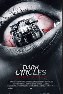
The Low-key Lighting/ violent iconographies depicted on this film poster are most likely to attract male explorers/ reformers as darker aesthetics are more likely to attract male audiences according to my research. The colours of red and black contrast and compliment each other nicely in which the house (which replaces the pupil) breaks the 4th wall through bolding out into the audience face.
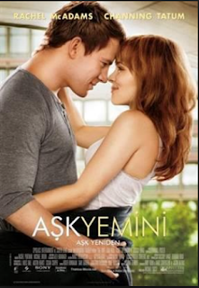
However, the bright lighting/ warm iconographies which are present on this film poster are more likely to attract a female psychographic audience. This ultimately relates to the interests of females as they are typically more fixated on "romance" in comparison to males who are more fixated on attention on violence/ action which is ultimately considered as a "dominant ideology" within the media - the media attempt to fulfil these qualities through the representation of genders and iconographies.
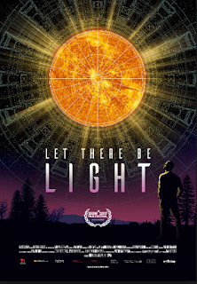
However, the Film Posters depicted here compensate for the requirements of both the male and female explorers/ reformers as there is an equal contrast of bright and dark colours on the film posters which as a result fulfils their aesthetic needs. Both film posters also acquire patterns which implies that they are more likely to attract/ captivate the female proportion of the psychographic group whilst simultaneously attracting the male psychographic proportion through the maintenance of dark and bold colours.
I will ultimately use this research when constructing my Film Poster in order to incorporate the atheistic requirements which both appeal to both the male and female proportion of my psychographic sample.
Drafts:
Before I create my Film Poster, I must establish what aesthetics I must incorporate into my film poster in order to attract my selected demographic/ psychographic group. I will research into this area and apply the information that I have found to my own film poster that I will be creating.
What did I find:
1 - I found that the majority of my psychographic group are males who ultimately prefer darker and bold colours.
2 - However, I found that just under half of my psychographic group are females who ultimately prefer brighter colours and a broad range of patterns.

The Low-key Lighting/ violent iconographies depicted on this film poster are most likely to attract male explorers/ reformers as darker aesthetics are more likely to attract male audiences according to my research. The colours of red and black contrast and compliment each other nicely in which the house (which replaces the pupil) breaks the 4th wall through bolding out into the audience face.

However, the bright lighting/ warm iconographies which are present on this film poster are more likely to attract a female psychographic audience. This ultimately relates to the interests of females as they are typically more fixated on "romance" in comparison to males who are more fixated on attention on violence/ action which is ultimately considered as a "dominant ideology" within the media - the media attempt to fulfil these qualities through the representation of genders and iconographies.

However, the Film Posters depicted here compensate for the requirements of both the male and female explorers/ reformers as there is an equal contrast of bright and dark colours on the film posters which as a result fulfils their aesthetic needs. Both film posters also acquire patterns which implies that they are more likely to attract/ captivate the female proportion of the psychographic group whilst simultaneously attracting the male psychographic proportion through the maintenance of dark and bold colours.
I will ultimately use this research when constructing my Film Poster in order to incorporate the atheistic requirements which both appeal to both the male and female proportion of my psychographic sample.
Drafts:
Now onto the drafting! Luckily for you, all of my drafts will be provided under this section. By now, we all know I'm a terrible drawer, so don't allow my drawing skills to throw you off! I would also like to point out that I have decided to use Pixlr, instead of Photoshop in order to create my film poster! This was because I was unable to obtain a Mac over half term (which has Photoshop). Therefore, I decided to use Pixlr instead!
I used this tutorial video in order to quickly learn how to navigate Pixlr, as I have not used Pixlr in the past!
Draft 1:
Here is the first draft of my film poster. Though it may look a bit messy (as a result of the annotating), it includes everything required in order to qualify as a film poster. As you can see, I have incorporated essential iconographies/ images into my film poster which acquire a strong connection/ relation to the narrative.
The title is aligned in the centre of the poster so that it can be easily recognised/ identified by consumers, the tagline is poisoned directly underneath so that it is within the eye-line of the consumers. I have yet to decide upon the positioning of the credits which is why I have drawn boxes upon the top and bottom of the film poster in order to indicate where the credits will be positioned.
The reviews/ ratings will be poisoned along the sides of the door in the potential colours of red in order to incorporate some vibrancy into the film poster.
Draft 2:
Here is the second draft of my film poster. I have decided to take a different approach with this draft by which I have decided centre the title through attaching chains from one end of the poster, to the other (indicated through my drawings). The reviews are also scattered throughout the page in open spaces which enables them to be easily recognised by the target audience. Everything else has remained the same.
Draft 3:
Here is the third draft of my film poster. As you can see, in terms of the layout some major change has occurred. At this point, I had knowledge of the shot that I was going to use as the image of the film poster - it is the image of Christina looking through the locked door with the Burning flower merged into it through an opacity tool.
 |
| Centre Image. |
 |
| Merged Image. |
The title and the tagline will be located just underneath Christina's face (around the chin region) with the reviews aligned around Christina's face so that it does not interfere with the focal area of the poster. The Production logo along with the distribution company logo (BFI) will be located in the bottom left hand corner of the film poster as a result of the changes to the format of my poster. The name of the candidates/ actors/ actresses will be aligned along the top film poster.
Computerised Progress of my film poster:
So I have opened a new page, and used the image of a shot from my film which resembles the shot drawn on the third draft of my film poster. During this stage, I have implemented the: title, tagline, credits and featured actresses in order to form the basis/ layout of my film poster which I will work around.
I have decided to position my title along the top of my film poster in comparison to the centre of it. I decided to change the poisoning of the title as it would have covered the focal point of my film poster (the protagonists face) and would therefore inhibit the affect of my film poster upon the audience:- it would also fail in arising attention, according to the AIDA Model.
As I have moved the positioning of the title, I have no other choice but to also move the positioning of the tagline so that it is positioned directly underneath the title. However, the positioning of everything else has remained how it was in my drafts!
Here I added in some minor details, by which I implemented the age certificate which is indicated in the bottom right hand corner, the production logo and distribution logo located in the bottom left hand corner, and a review (located in the left) which I will finish during my final step which is depicted below!
During this stage, I implemented the final touches into my film poster. I incorporated four reviews from well-known newspapers which appeal to my audience demographic/ psychographic in order to gain their attention. I also got to grips with the opacity tool in order to merge the burning flower image, into the image with Christina looking through the door.
I also navigated the colouring functions of Pixlr in order to alter the colouring of the film poster (for example, the flame is indicated in blue, the colouring of the same image is indicated in monochrome in order to signify it's lack of significance to the film poster).
Draft 1:
Research:
In order to gain some feedback of my film poster, I am going to approach my peers (who match my audience demographic/ psychographic) and ask them whether they approve of my film poster or not. If their response is no, I will ask them how it could be proved upon.
My results are shown below:
1) Firstly, I have been notified that I have included too many reviews, in which the reviews that I have referenced are stated by newspapers, when they are so-posed to be written by newspapers which specialise in films/ the media such as: The Times and Empire.
2) Secondly, the font (some shades of red) are a little difficult to read as the background image is a too bright which interferes with the appearance of the text. Therefore, I have been advised to change the colouring of the font (even to use a different shade of red) and to use a combination of fonts in order to mix the poster up a bit.
3) Thirdly, my peers have alerted me that there is no need to include the distribution company logo, however, it is an essential to include the production company logo. They also told me that the production logo should be cropped as it currently appears "too simplistic" in a "copy and pasted" manner.
Draft 2:
After reviewing my results, I have decided to apply the changes which I indicated during my primary research in order to fulfil the desires of my audience demographic/ psychographic - combination of dark, bold and bright colours. As you can see, I decided to limit the number of reviews in which they are now presented in a different font/ colour so that the aesthetics are more pleasing/ compliment each other nicely. Also, I have decided to crop my production logo in order to divert way from the "simplistic" stigmatism that was previously applied to it.
I have also decided to remove irrelevant information that wasn't meant to be present on the film poster, such as: the distribution company (BFI) etc. Furthermore, my previous draft was criticised for being too crowded, therefore, through removing unneeded information, I have opened up space.
Final Film Poster Draft:
Ancillary Task 2: Film Review
Let's move on to my next ancillary task! My second ancillary task is to produce a film review on my A level production, "The Gatekeepers". This division of my ancillary task page will show you the steps I took to produce my film review. I will also research into film reviews in order to support my progress/ decisions confirmed during the process.
What is a film Review?:
So what actually IS a film review? Well, a film review is a criticism/ analysis/ evaluation of a film, it should be written in an essay format in which it is relatively short (600-1200 words). Similarly to film posters, film reviews can also be used as an advertising technique through being distributed by well known media outlets such as: newspapers, magazines, articles, websites etc.
In some cases, film reviews can be a little cutthroat in which the writer has the right to critique the product in any way that they like, whilst maintaining a formal writing style. In order to enhance the effectiveness of a film review, it's best to include comments which sets your film review apart from others which ultimately makes your film review stand out. HOWEVER, the film review cannot be too informal as it will not successfully appeal to the target audience.
Research into film reviews:
Film reviews can be presented in a wide range of media outlets in order to influence the flow of audience feedback/ attention from critics. This can ultimately be used as an advertising technique in order to encourage/ discourage the audience group to consume the product.
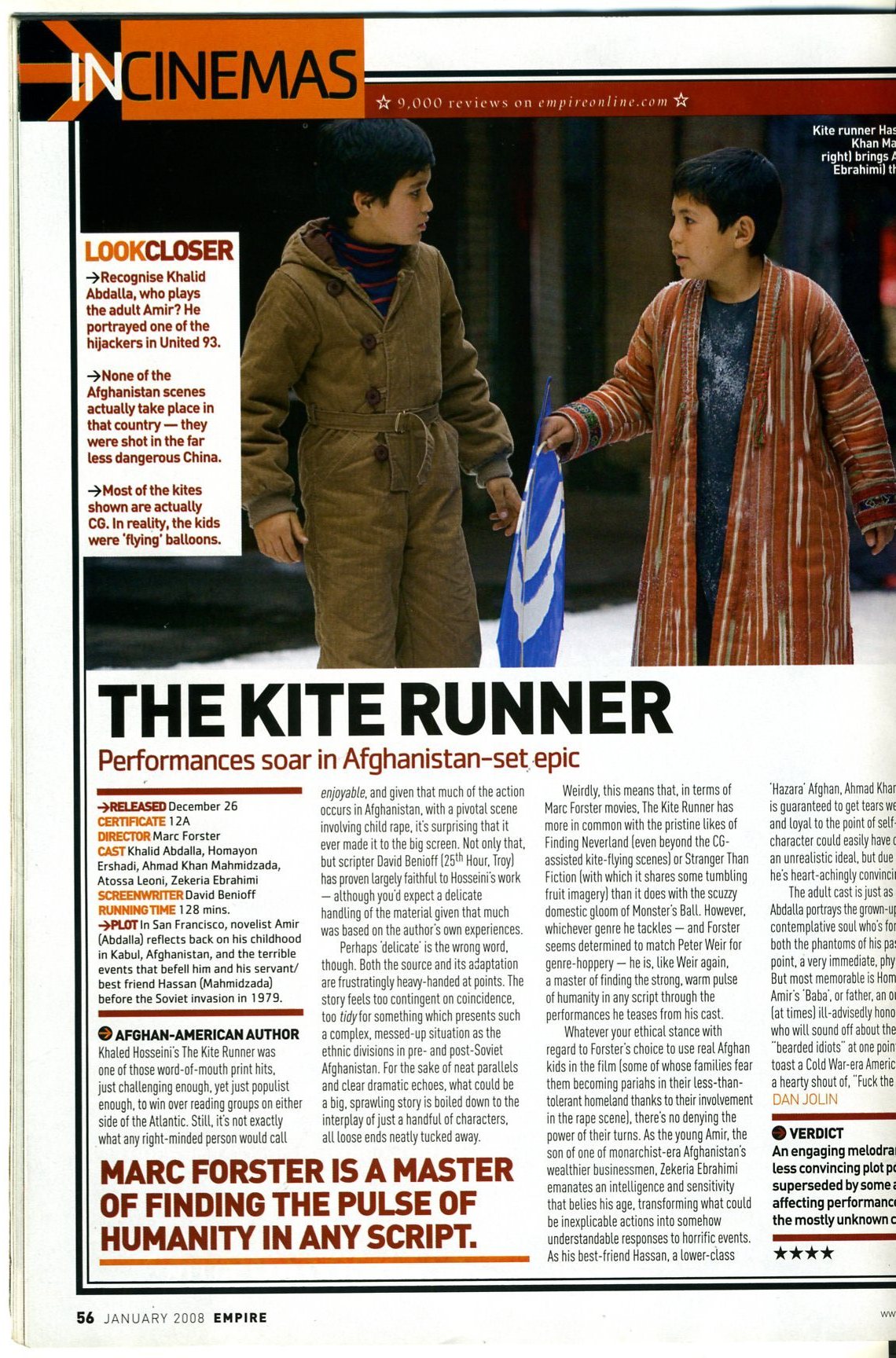
I have also researched and printed off an article into the essential requirements which must be included within a film review, I have summarised and devised my annotations into a list.
Film Reviews Must Include The Following: - My Findings from the articles!
 |
| Page 1 |
 |
| Page 2 |
- The name of the film/ title (largest piece of text)!
- Year of release.
- Name of Director.
- Screenwriters.
- Major Actors.
- Summary of the Plot.
- Star rating.
- Images - (But don't use an image that will give the plot away)!
- Quotes.
However, film reviews do not necessarily have to be written in a magazine/ newspaper, they can be condensed into a video and uploaded on a social media platform in order to arise attention. A few examples are depicted below:
1) Chris Stuckmann's Film Review of the 2017 remake of "IT" - Chris Stuckmann (the name of this reviewer) is a highly successful film reviewer in which he has accumulated a fan base of over 1 million subscribers on YouTube through writing and presenting his film reviews in a YouTube video. He has even written his own book on film reviews which reinforces his success!
Conclusion:
A correlation/ relationship that I have identified through using the method of publishing film reviews onto social media platforms such as YouTube, is that the higher the activity of the reviewer (the greater the rate that content is uploaded from the reviewer), the higher the rate of consumption/ popularity - positively correlated.
This suggests that if the reviewer is constantly providing content for their audience, then their reviews are going to gain more popularity/ expand their fan-base.
For example, the channel of the final reviewer (Number 3) is quickly growing as a result of her frequent uploads, this will enable her to establish a fan-base which will result in her film reviews obtaining a consistent number of views - expand her success.
Primary Research:
In order to investigate whether I should produce my film review for a newspaper or a magazine. I'm going to conduct an experiment in which I'm going to confront and ask several of my target demographic/ psychographic audience whether they would prefer to read a film review that was produced for a magazine or a newspaper.
My results are shown below in this bar chart:
Results/ Conclusions:
My research that I have conducted seems to support that idea that my target demographic/ psychographic audience prefers film reviews that are produced for magazines. As a result, I will take on board their advice and produce a film review page for a magazine!
Exemplars of Film Reviews:
1.
The most noticeable and largest piece of text on the film review is the title, this is essential so that the reader is instantly informed on what the film review is going to be on. The quotes are also relatively large and are highlighted/ are written in a different text colour so that the most important information can be identified by the reader even if they choose to read over the film review.
However, it took me a while to identify the star-rating of the film (it is positioned in the bottom right hand corner) which is a limitation of this film review as all of the essential criteria should be enlarged/ poisoned in the eye- line of the reader so that it can be instantly identified by the audience/ reader.
2.
This exemplar is completely different in comparison to the previous exemplar I briefly analysed. Within this film review, the images are proportionally smaller in which the writer has decided to concentrate more on the analysis itself through freeing up writing space.
Similarly to the first exemplar, the title is the largest piece of text on the page. However, this film review lacks colouring, colour is an essential tool in a film review as it typically reflects the conventions of genre that the film has embedded. For example, within a horror film review, a stereotypical colour coordination would be red and black in order to reinforce the codes and conventions of the horror genre.
Apart from the title, the only other noticeable piece of the text is the quotes indicated in blue, it is also indicated in a different font in comparison to the rest of the film review in order to make it more noticeable for a reader who reads the film review on the surface.
3.
Annotations are shown on the document!
Drafts:
4.
I have noticed that all Film Reviews typically conform to a similar structure! The majority of film reviews typically position an enlarged screenshot at the top of their review, with the title positioned just below the image. This ultimately flows into the introduction/ facts of the production (cast, star rating, etc.)
Quotes are also positioned throughout the review in order to engage the reader further into the production through contrasting to similar productions/ highlighting the productions strengths and weaknesses which can be used to reinforce a statement within the analysis.
This ultimately enables me to formulate a base of my film review, "The Hurricane Heist Review" depicted above is a perfect example of the format that I desire to follow/ take inspiration from in order to construct my film review as it follows a basic format which engages the reader through it's convincing language and structure, which enables one paragraph to vividly flow into the next.
Now that I am familiar with the structure/ content of a film review, I'm now going to start creating my own film review for my production, "The Gatekeepers".
I am now going to create my own Film Review! I will show you the progression of my Film Review through my planning/ drafting that follows! I am going to start through drawing and formulating the base of my Film Review through establishing its basic design/ format. Once I have developed upon my drafts, I will ultimately use Microsoft Publisher in order to actually create my Film Review!
The Design:
Straight away, I was faced with my first decision, what orientation should I use for the layout of my Film Review - Landscape or Portrait? I have encountered a rage of orientations during my research into film reviews and have concluded that both are effective if used CORRECTLY!
Landscape Draft:

The image shown to you above is a draft of my potential Film Review in a landscape orientation, the annotations provided indicate where the information would be positioned. In order to establish a fair comparison with the Portrait Draft of my Film Review, I decided to create a computerised version on Microsoft Excel. The computerised Draft is shown to you below!

Personally, I did not like the way how this Film Review turned out. The colours: white, black, grey and red, do not contrast each other at all which ultimately has an impact on the aesthetics required in order to establish a professional/ well-designed Film Review.
The lack of pictures inhibit the reading experience of my Film Review too as it is simply too word heavy which is less appealing to the audience group as it has an impact on the structure of my Film Review.
Though this could have been easily overcome as a result of the flexible space provided to me on the page, I would have found it difficult to rearrange the structure of my landscape film review draft as I would have had to adjust everything on the page. Therefore, I attempted to create my Portrait draft instead!
Portrait Draft:
The image shown to you above is the Portrait draft (orientation) of my Film Review. I instantly preferred this draft over my Landscape draft as:
1 - The Film Review will be easier to create through the basic design/ format.
2 - Simplistic layout of the Review (The layout of my landscape draft was overcomplicated).
3 - More opportunities to contrast the colours.
4 - More opportunities to implement images into the Review (enhances decoration aspect/ aesthetically powerful).
5 - Flexible spacing.
Therefore, the Portrait Draft succeeds where the Landscape Draft failed which ultimately encourages me to utilise the layout of my portrait draft for my Film Review!
In order to establish a conclusion, I have created a graph which depicts a direct comparison of both Drafts, these are shown to you below:
Landscape Format:
|
Portrait Format:
|
Flexible space
|
Restricted Space
|
Complicated Design
|
Simplistic Design
|
Lack of colour contrasting
|
Plenty of opportunities for colour contrasting
|
Atheistically Weak
|
Atheistically Powerful
|
Lack of decoration: for example, Images
|
Plenty of Decoration
|
Restricted adjustments
|
Flexible adjustments
|
Complicated Structure
|
Simplistic/ easy-to-follow Structure
|
Restricted reading experience
|
Enhanced reading experience.
|
As you can clearly see, the strengths of my portrait draft overpower those of my landscape draft. The landscape draft acquires more weaknesses (indicated in red) in comparison to my portrait draft which suggests that my Film Review would be less effective/ successful if I decided to utilise the idea of using a landscape format to create my film review.
Therefore, I have decided that I am going to develop upon and use the Portrait Format in order to create my Film Review. I have decided upon this as the table that I constructed, indicates that there would be more implications (indicated in green) if I decided to use a Portrait format in comparison to a Landscape format which acquires more downfalls!
Draft 2:
Here is the second draft of my film review. As you can see, I have developed upon my first draft and have incorporated many more images in order to contribute to the aesthetics of my Film Review as a whole, and have introduced quotes into my Review in order to reinforce a statement which accommodates within my analysis. This has ultimately had an impact on the layout/structure of my Film Review. Through incorporating images/ quotes into my review, they have stratified my review into sections which will all be specified on one specific topic area to focus on. For example, one section/ paragraph will concentrate on the cinematography of my production, whereas, another will focus on the effectiveness of my plot and so on. As you probably noticed, I took inspiration from the Film Reviews that I researched into in order to formulate the backbone structure of my review (columns).
The title of my review is shown at the top of the page and written in a different font so that it is easily identifiable by the reader, in which the reader is instantly informed what my film review will be written about. Images will be shown above my title in order to contribute to the aesthetics of my film review in which the colouring of the boarders (red) will match the colouring of the font (which will also be shown in red).
Computerised Outcome: Draft 1
 |
| Page 1 |
 |
| Page 2 |
For the most part, I conformed to my draft work in which the format is fairly similar to my second draft! I ensured that the colours contrasted each other nicely (which was something that was lacking in my landscape draft). The red font/ boarders break the conformity of the black and white text which ultimately contributes to the aesthetics of my Film Review.
I incorporated screenshots from my production into my Film Review in order to break up the chunks of writing which would have emulated a negative impact at face value (too word heavy/ discouraging for the reader). Ultimately, this works in my favour as my Review would attract more consumers through the manipulation of the text through a series of images, which is visually pleasing to the consumer.
Film Review Final Draft:
Page 1
Page 2
----------------------------------------------------------------
You have reached the end of my Ancillary Tasks Page, please transfer over to my Evaluation Page via the white arrow located in the top left hand corner which will take you back to my home page!
----------------------------------------------------------------








Comments
Post a Comment